Project overview: As to learn the basics of information architecture, I was assigned to create e-commerce platform for local business. (Conceptual work only)
Client background: Progress Hardware, neighborhood hardware store located at Sunset San Francisco wants to renew its website. It wants to add e-commerce platform.
Thought: People visit online-stores for convenience, so I tried to create a platform that is efficient for all kind of users (loyal/ frequent / first time ). Then I added Progress Hardware's personality by Art direction and Copy writing.
Progress Hardware is neighborhood Hardware store in Sunset, San Francisco. It was established in 1948. It wants to renew their website to strengthen it's tie to local community by bringing their service beyond storefront.
People visit online stores for convenience. Especially for hardware, people purchase tools for specific problems. So usability is important. By iterating researches and user tests, I tries to create shopping experience that is smooth for all type of user (Loyal / Frequent/ First time).

Navigation bar
I conducted card sorting exercise to see how people categorize hardware. And I realized that there is no clear patterns. So I made all categories visible at once by adopting mega navigation menu.

Product page
With depth heuristic research on e-commerce sites and with the feedbacks from user testing, I created product page with following features
- Core information on the top of the page
- Detailed information below people who reads
- Picture gallery for detailed image of the product
- Review / staff recommendation for further information

Log in Feature
To smoothen return user's shopping experience, I implemented account page. Main features are following
- Save payment information/ billling and shipping addresses
- Order status/ Order history
- Order from the history
- SNS sign up /sign in feature

Check out
I experimented few design pattern and developed the design with most positive feedback.
- Separating check out process to 3 steps
- By autofill feature for return customers
- Hide text field when autofilling, add plus button to show text field

Color
I created color theme by using their primary brand color as well as using the color that is often seen in hardware tools.
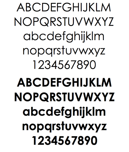
Font
I choose Century Gothic for the font. Progress Hardware is friendly yet trustworthy. Friendly yet established font can well communicate personality of Progress Hardware.

Photo Mood board
Progress Hardware only store those tools that they try and trust in. I try to communicate this select shop like sophistication by selecting photos that visually communicate craftsmanships.

Copy Writing
What keeps customers to come back is Progress Hardware's personality. To reflect store's personality, copy is written in friendly and casual manner.